

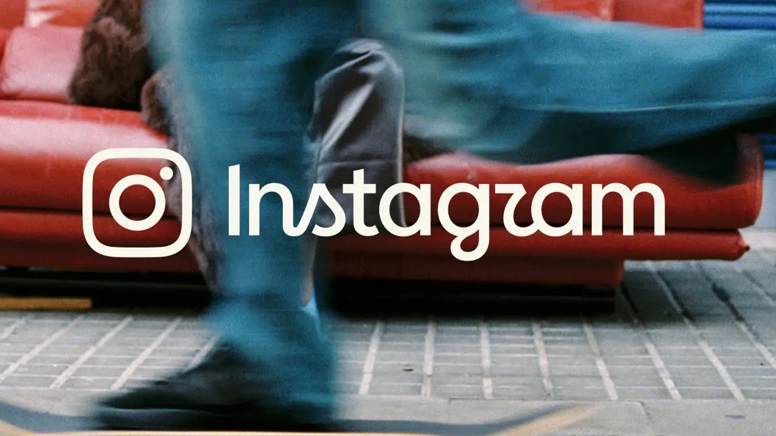


Instagram has given its identity a refresh, updating its familiar wordmark for the first time in a decade with a cleaner, more contemporary take on its signature script. The new wordmark retains Instagram’s signature script, with subtle changes to its lettering and overall design
According to Meta, the design team explored hundreds of directions, from all-caps and camera-inspired concepts to literal handwriting, before returning to the script style long associated with the platform. The refresh also extends across Instagram’s wider brand system, introducing more subtle use of its gradient, refreshed motion and layouts, an updated Instagram Sans and two new typefaces, Instagram Pen and Instagram Mono.
Don’t miss: Why would a recognisable brand like Coca-Cola need a refresh?
Adam Mosseri, head of Instagram, said the wordmark at the top of the app had not changed in 10 years and was due for a refresh, describing the new look as “cleaner and more modern” while retaining the simplicity and craft of the original
The refreshed wordmark is now rolling out globally, with the wider identity following through 2026 and beyond
Meanwhile, Mercy Lo, creative director at Hong Kong-based digital agency KREW, said the logo feels like a natural visual evolution that fits right in with current design aesthetics, likely driven by Instagram’s ongoing effort to periodically keep its brand identity fresh
Updating the wordmark after a decade while keeping the camera icon unchanged is a simple, balanced refresh, she added. “For users and clients, keeping the icon preserves familiar brand recognition, while the updated typography keeps the look current for both its maturing audience and younger generations such as Gen Z and Gen Alpha. It gives Instagram a subtle visual polish that distinguishes it from Facebook and Threads while keeping its core identity intact.”
What brands had to say
And, as is often the case on the internet, it did not take long for other brands to get in on the makeover
KitKat was among those riffing on the refresh, giving its “Have a break” line an Instagram-inspired treatment while reassuring followers that “one thing that will never change” is the importance of having a break
ChatGPT joined in too, adopting the handwritten aesthetic to transform its name into the phonetic “chatjipiti”
The playful responses may be good for a laugh, but they also raise a broader question around the refresh: after a decade with the same wordmark, was it simply time for Instagram to give its identity something new?
Every now and then, a brand needs new news. That’s perhaps why Instagram updated its wordmark after 10 years, said Anish Daryani, founder and group CEO, Moonfolks and president director, Havas Moonfolks. Personally liking the new look, Daryani said the minimalist look is in line with Instagram Sans font they launched earlier
“It builds on the previous cursive style but adds a bit more styling by playing around with the ‘s’, ‘g’ and ‘r’, making it more of a hybrid font,” he said, adding that while some might raise the confusion between the alphabets r and z, most know the brand well enough to know what it stands for
Most importantly, he added that just changing a wordmark isn’t good enough:
A few more features in the app, UI and UX that reflect the new design philosophy would make this change a tad bit more meaningful
A new chapter or just new handwriting?
Picking up on that tension between refreshing a familiar identity and meaningfully signalling change, Kristian Olsen, managing director at Type A Digital, was less convinced by the new look
“People rarely like change, especially when it comes to something as familiar as Instagram. If you’re going to change something as recognisable as your logo, I think there needs to be a pretty good reason for doing it,” he said, adding:
It’s different, sure. I’m just not convinced it’s better
While Olsen acknowledged that Instagram itself has changed significantly over the years, he questioned whether the refreshed identity goes far enough to represent that evolution
“Instagram says this is part of a wider brand refresh, so I’d imagine the thinking is pretty straightforward – the platform has changed massively over the years and they want the brand identity to reflect that,” he said
However, Olsen argued that if the intention was to signal Instagram’s next era, the platform “could have been much braver”, particularly given how dramatically the way people use and consume content on Instagram has evolved
“For me, this feels more like a visual refresh than a reflection of how far Instagram has actually come,” he added
James Chua, founder of creative agency Sweatshop said in general the typeface definitely feels more modern, but from a branding point of view, it doesn’t add more personality or make the brand more iconic than the old logo
Chua added that to make the move more meaningful, instead of just a logo change, it could have been more meaningful if it is also accompanied by a change in the experience of Instagram itself.
“Feature enhancements or translating the handwritten, more human identity into a broader brand promise especially in the days of AI where a lot of their content on their platform are AI slops,” he said
Related articles: Can Penguin’s playful flock carry the brand into the digital age without losing soul? KFC wants you to dip, dunk and drink your way through its next chapter Pizza Hut MY rolls out global brand refresh locally through culture-led experiences
Free newsletter
Get the daily lowdown on Asia’s top marketing stories
We break down the big and messy topics of the day so you’re updated on the most important developments in Asia’s marketing development – for free
subscribe now
open in new window
Related:
<a href="https://yoursite.com/automation-training-benin/” title=”Digital Automation Training Benin: 5 Winning Skills Employers Demand in 2026″>
Digital Automation Training Benin: 5 Winning Skills Employers Demand in 2026
WhatsApp Marketing Automation Africa: 6 Dangerous Mistakes Brands Make in Nigeria
Want to learn this practically?
Join Justfine Infotech and build real digital skills in AI, automation, web development, digital marketing, office productivity, e-commerce, freelancing and cybersecurity.
Available Programmes:
6 Weeks Certificate • 3 Months Professional Certificate • 6 Months Diploma • Full Professional Diploma
WhatsApp:
+229 01 57 57 99 15
+229 01 66 68 11 60
Source: www.marketing-interactive.com